Welcome to this online version of my R workshop! I put this together to make the code we covered in-person more digestible. Each of the code chunks has the expected outputs and explanations of what it does. It should act as a self-directed tutorial. If you have any questions, please don’t hesitate to get in touch with me ([email protected]).
If you prefer, you can download this as an R Notebook (html file).

This work is licensed under a Creative Commons Attribution-NonCommercial 4.0 International License.
Part 1: getting started
Installing R and Rstudio
- Download R from CRAN (The Comprehensive R Archive Network). There are versions available for Windows, Mac and Linux.
- Follow Windows installation instructions (or equivalent).
- Download RStudio Desktop
- Follow Windows installation instructions (or equivalent).
If you’ve managed to install R and RStudio, you should have something that looks like this:
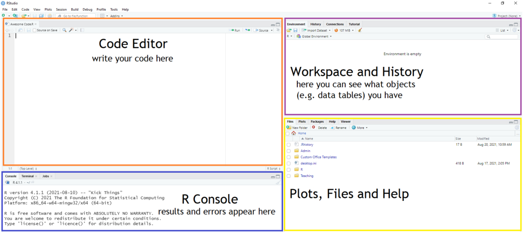
In the top left, we’ve got the window where we’re going to write our code. Below this we have the console. This is where results from calculations, statistical tests etc. and error messages appear once you’ve ran code. On the top right we have the workspace. The tab currently showing is the global environment which will list all the objects we create (e.g. data tables, values). Finally, in the bottom right we have the window where we can access files, packages, help and plots. When we come to plot graphs later on, they’ll automatically appear here.
Part 2: syntax and functions
Let’s have a go at running some simple calculations. To run one line of code, click anywhere on it and then either press the Run button (top right of the code editor window) or use the shortcut Ctrl + enter. To run multiple lines of code, left click with the mouse to highlight and again, run using the button or shortcut. Note how the results appear in the console window (bottom left).
1+2## [1] 34*3## [1] 128/2-3## [1] 12^3## [1] 8In R, the bit of code we’re going to use most is <-. This is called an assignment operator and it’s used for assigning a variable. I find it simpler to think of it as meaning is. For example, x <- 5 means x is 5.
x <- 5
y <- 3
If you look at the environment window (top right), you should see that x and y are now listed under values. These are referred to as objects. Object is an umbrella term for anything you create in R which includes values and data frames. You can then use x and y to run calculations.
x + y## [1] 8x*y## [1] 15Data types
Let’s familiarise ourselves with some of the different data types in R. If you’re ever not sure what something is, you can use the class function to find out. A function is a bit of code which performs a specific task. Functions can be single words as we have here, or can be more complex and span multiple lines.
class(1)## [1] "numeric"class(x)## [1] "numeric"In the two examples above, the data type is numeric. x is numeric because remember, we used the assignment operator to tell R it is 5.
class("Marzipan")## [1] "character"class("1")## [1] "character"I always knew Marzipan was a character!

These are examples of character data also known as strings. These can contain any letters, symbols, spaces etc. surrounded by either single or double quotations. Why is this important? R treats data types differently and if something is assigned the wrong data type, you can run into issues.
a <- "1"
b <- "2"
Here, a and b are the character type of data. If I tried a+b, I’d get an error message because R can’t calculate that.
Part 3: importing and analysing data
There are several options for importing data into R and this is not an extensive list by any means.
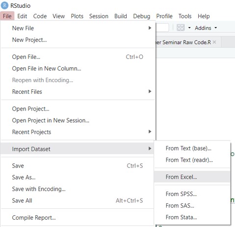
Option 1: importing an Excel file using RStudio
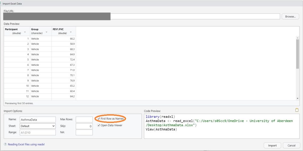
This is probably the easiest option for newbies because there’s no coding involved. You can download my sample dataset from my website if you want to practice this. For this particular dataset, make sure you tick the box for First Row as Names (circled).
Option 2: importing from my GitHub repo
A good option if you want to collaborate with other researchers on projects is to keep your data and code in an online repo such as GitHub.
AsthmaData <- read.csv("https://raw.githubusercontent.com/RegenMedCat/Teaching-Sample-Data/main/AsthmaData.csv")Option 3: importing a csv file
If you have files saved on your computer, you could paste in the file path in place of the url. It can be a little bit of a faff because depending on your PC, you might need single or double forward or backslashes within the file path. Note that your file will need to be saved as a csv (comma separated file) for this to work.
Checking data
Always make sure your data has imported ok and looks as you expect. There’s several options for this including head(AsthmaData) which will show you the first 6 rows of the table in console. What I find easiest is double-clicking AsthmaData in the global environment window (top right) to open the table in a new tab.
| Participant | Group | FEV1.FVC |
|---|---|---|
| 1 | Vehicle | 66.2 |
| 2 | Vehicle | 58.9 |
| 3 | Vehicle | 68.3 |
| 4 | Vehicle | 64.9 |
| 5 | Vehicle | 72.4 |
| 6 | Vehicle | 67.3 |
Summary statistics
We’re now going to calculate summary statistics for this dataset. We’re going to do this using the tapply function. The $ means select column. We use it here to firstly select the FEV1.FVC column in the table and then Group because we want means and SDs for each group.
tapply(AsthmaData$FEV1.FVC, AsthmaData$Group, mean)## Drug Vehicle
## 77.51667 67.15000tapply(AsthmaData$FEV1.FVC, AsthmaData$Group, sd)## Drug Vehicle
## 5.461241 5.041555Running an unpaired t-test
We’re now going to run an unpaired t-test using the t.test function. If we just ran this alone, R would error because we haven’t given it enough information to complete the task. It would be like having a decorator around at your house and just telling them to paint. They would need more details such as the room and the paint colour. In R, these details are called arguments and follow in brackets after functions. The ~ means modelled by. Another way of thinking about it is that we’re firstly telling R which column to find the data in (FEV1.FVC) and then what variable we want to compare (Group). Lastly, we need to tell R where to find the data so we specify data = AsthmaData.
t.test(FEV1.FVC ~ Group, data = AsthmaData)##
## Welch Two Sample t-test
##
## data: FEV1.FVC by Group
## t = 4.8316, df = 21.861, p-value = 8.056e-05
## alternative hypothesis: true difference in means between group Drug and group Vehicle is not equal to 0
## 95 percent confidence interval:
## 5.915352 14.817981
## sample estimates:
## mean in group Drug mean in group Vehicle
## 77.51667 67.15000If you’re ever unsure about how to use a function or just want to know more, you can open the help pages on it using ?. What I find easiest is looking up the same help pages online.
Part 4: packages
Packages are really useful because they contain additional functions or improve upon existing ones in base R. To be honest, there is very little I do in base R. If you’re using a package for the first time, you’ll need to install it using install.packages("packagename"). This can might take a couple of minutes but you only need to do this once. Afterwards, load it using the library function. This has to be done each time you open R.
library(cowsay)say("You're doing a great job")##
## --------------
## You're doing a great job
## --------------
## \
## \
## \
## |\___/|
## ==) ^Y^ (==
## \ ^ /
## )=*=(
## / \
## | |
## /| | | |\
## \| | |_|/\
## jgs //_// ___/
## \_)
## While admittedly not very useful, this is something base R can’t do. If you were to try using the ‘say’ function without having the cowsay package installed and loaded, you would get an error message in the console (bottom left) saying function not found.
Part 5: tidyverse
Ok, let’s quickly look at a package that’s more useful. If you’re ever going to use R for data science, then tidyverse is THE package. It’s a metapackage which contains multiple packages for everything in the data science process from data wrangling to visualisation. What we’re going to be using here specifically is the ggplot2 package for plotting a simple bar graph. To get started, you’ll need to install either tidyverse or just ggplot2 using the install.packages function.
library(tidyverse)Loading the pain dataset
The sample data we’re going to use are patient-reported pain scores using a 10 point scale where 0 is no pain and 10 is the worst pain imaginable. We’ll import the data from my GitHub repo as described earlier.
PainData <- read.csv("https://raw.githubusercontent.com/RegenMedCat/Teaching-Sample-Data/main/PainData.csv")Plotting a basic boxplot
The gg in ggplot stands for grammar of graphics. There’s a lot of new syntax used here that is quite different from base R. In summary the steps are:
Layer 1: creating a ggplot object
Create a ggplot object using the ggplot() function. Within the brackets, we’re going to specify what data we want to plot with data =.
ggplot(data = PainData)
Layer 2: mapping aesthetics
Use the aesthetic function aes for what’s called aesthetic mapping. Essentially, this is us telling ggplot what data we want to put on what axis.
ggplot(data = PainData, aes(x = Group, y = Pain.Score))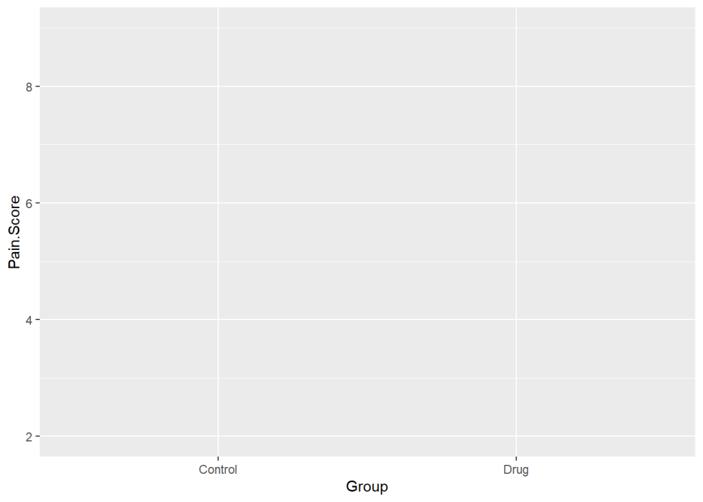
Layer 3: adding geometry
Specify the geometry (how we want the data to be displayed). For a boxplot, we use geom_box, for a line graph you’d use geom_line, for bars geom_bar etc. Note how we use a + at the end of each line add things to the ggplot object.
ggplot(data = PainData, aes(x = Group, y = Pain.Score)) +
  geom_boxplot()
Layer 4: adding additional geometries (optional)
In ggplot, you can add additional geometries. Here, I’ve added individual data points using geom_point. Note that the order the geometries appear in your code, is the order they will be plotted in. Here, geom_boxplotappears first it will be on the bottom and geom_point will be on top.
ggplot(data = PainData, aes(x = Group, y = Pain.Score)) +
  geom_boxplot() +
  geom_point()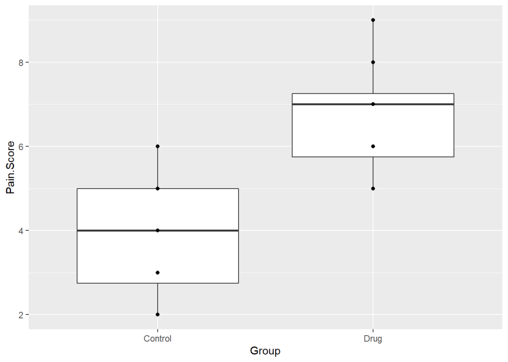
Something odd is happening. There are 12 participants per group but we’re only seeing 5 points. The reason is that there are repeated values which are on top of each other. We can space them out along the x-axis using position = position_jitter(). I’ve used w = 0.2 here but it can take some trial and error to find what value works best. I’ve specified h = 0 so the values will not be spaced along the y-axis and remain on their exact scores.
ggplot(data = PainData, aes(x = Group, y = Pain.Score)) +
  geom_boxplot() +
  geom_point(position = position_jitter(w = 0.2, h = 0))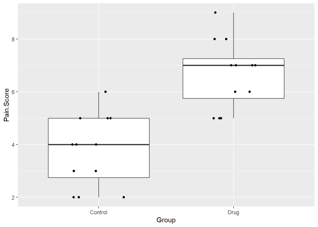
Layer 5: axis labels and axis limits
I’ve adjusted the y-axis using the scale_y_continuous function. I’ve used limits=c(0, 10) so we see all 10 points in the scale. breaks = seq(0, 10, 1) sets the tick marks at 1. I’ve removed the label on the x-axis using xlab("") because I don’t think it’s needed. I changed the y-axis label using ylab("Pain Score").
ggplot(data = PainData, aes(x = Group, y = Pain.Score)) +
  geom_boxplot() +
  geom_point(position = position_jitter(w = 0.2, h = 0)) +
  ylab("Pain Score") + #changing label
  xlab("") + #removing default label
  scale_y_continuous(limits = c(0, 10, 1), breaks = seq(0, 10, 1))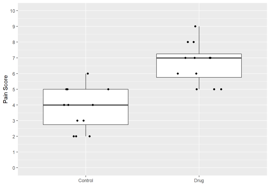
Layer 6: customisation
I find the default grey background on plots very ugly. The easiest way to get rid of this is by using theme_classic. I’ve also increased the base size of the text, and lines here by specifying base_size = 16. I’ve used fill = "skyblue3" to change the boxes to blue. There’s hundreds of in-built colours in R summarised in this handy table. You can instead use hex codes (e.g. “#1C4392”). I’ve also increased the size of the points using size = 2.
ggplot(data = PainData, aes(x = Group, y = Pain.Score)) +
  geom_boxplot(fill = "skyblue3") +
  geom_point(position = position_jitter(w = 0.2, h = 0), size = 2) +
  theme_classic(base_size = 16) +  #theme without ugly grey grid, also increase base size
  ylab("Pain Score") + #changing label
  xlab("") + #removing default label
  scale_y_continuous(limits = c(0, 10, 1), breaks = seq(0, 10, 1))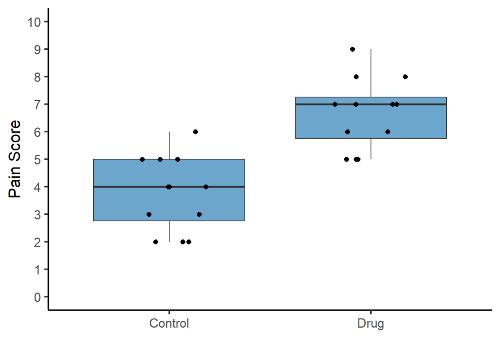
That concludes the workshop. Well done if you’ve successfully ran all the code!